New website
Over its life cycle, a website’s design goes through these phases in the eyes of its owners:
- Excitement
- Sobering up
- Hatred
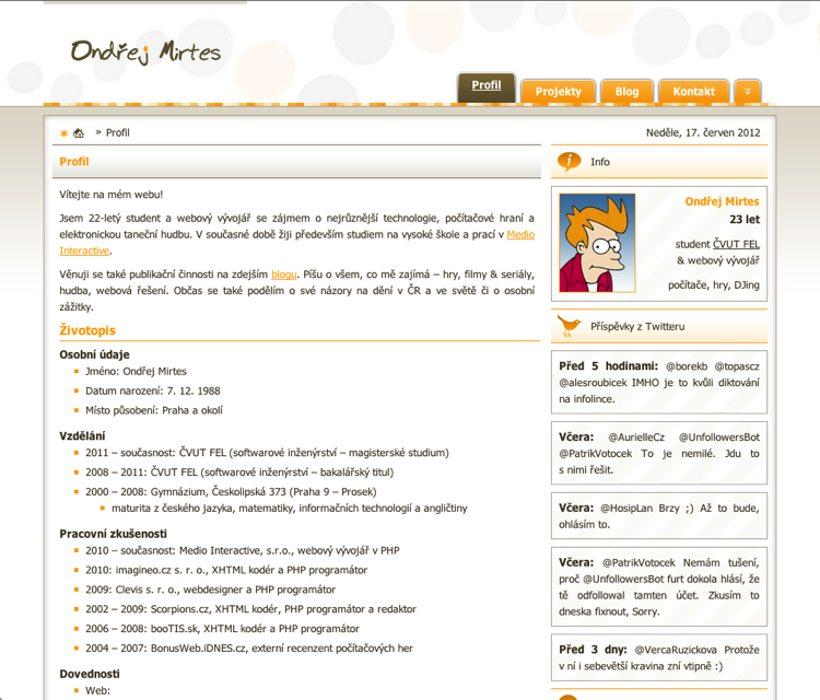
I reached phase 3 with my own (now old) website the moment I learned from Honza Korbel at Webexpo 2009 that boxed-in little boxes are out. So, quite a long time ago. What finished me off was when I started getting interested in usability (that early!) and minimalism and realized that most of the features I had put on it were actually completely pointless. I threw them all out.
To give you an idea of everything my old website could do:
- Fetch and display, in the right-hand column, the latest songs I’d scrobbled on last.fm (!!!)
- Fetch and display my latest tweets
- A contact form
- A poll that I never once changed, and in which the first option had the most votes only because submissions were sent via GET, so every bot that came to the site voted for it
- Article categories, where I had to create a new one for nearly every newly published article
- Splitting an article into a teaser and the body, so the user had to click through to it from the article list; same in the RSS
- Comments
When designing the new website, I drew inspiration from my favorite blogs (you’ll find them in About me in the Subscribed section). They all follow a format of two types of posts - external links and full-fledged articles. I enjoy consuming this format and figure it could be sustainable for me in the long run. I want to make this place into my own kind of Twitlonger.
I scrapped comments because they annoyed me. Even when the seed of an interesting discussion sprouted in them, it quickly rotted away, because who’s going to remember to revisit every site they recently commented on…
Responses can always be written on Twitter, and if someone replies in the form of an article, I’ll be happy to link to it.
I’m curious when Ondřej Hrabal will tip over into phase 3, and whether he’ll like the new design as much as the old one. I’d be more than glad!